BUZZ Signal
Bumble is a social app designed to help people find connections through its dating, friendship, and professional networking modes. This project explores how Bumble could extend its mission through integrating precision location notifications.
Client:
Bumble
Type:
Product, Interaction Design, iOS
Duration:
2 Months
Duration:
2 Months
Year:
2025
Challenge
I was given a design brief, functional specifications, and user data from Bumble to design a screen-based application that leverages precise location notifications to increase premium subscriptions.
While feasible, passive alerts alone risked feeling intrusive and lacked the context or intent needed to spark meaningful connection, and so I asked:
How might we design location-based meetups that feel intentional, safe, and user-controlled?
Helping young adults turn online matches into casual, real-world connections.
Based on research insights, I designed BUZZ as a feature within Bumble to address declining adoption and retention rates.
Activity-Oriented Opt-In
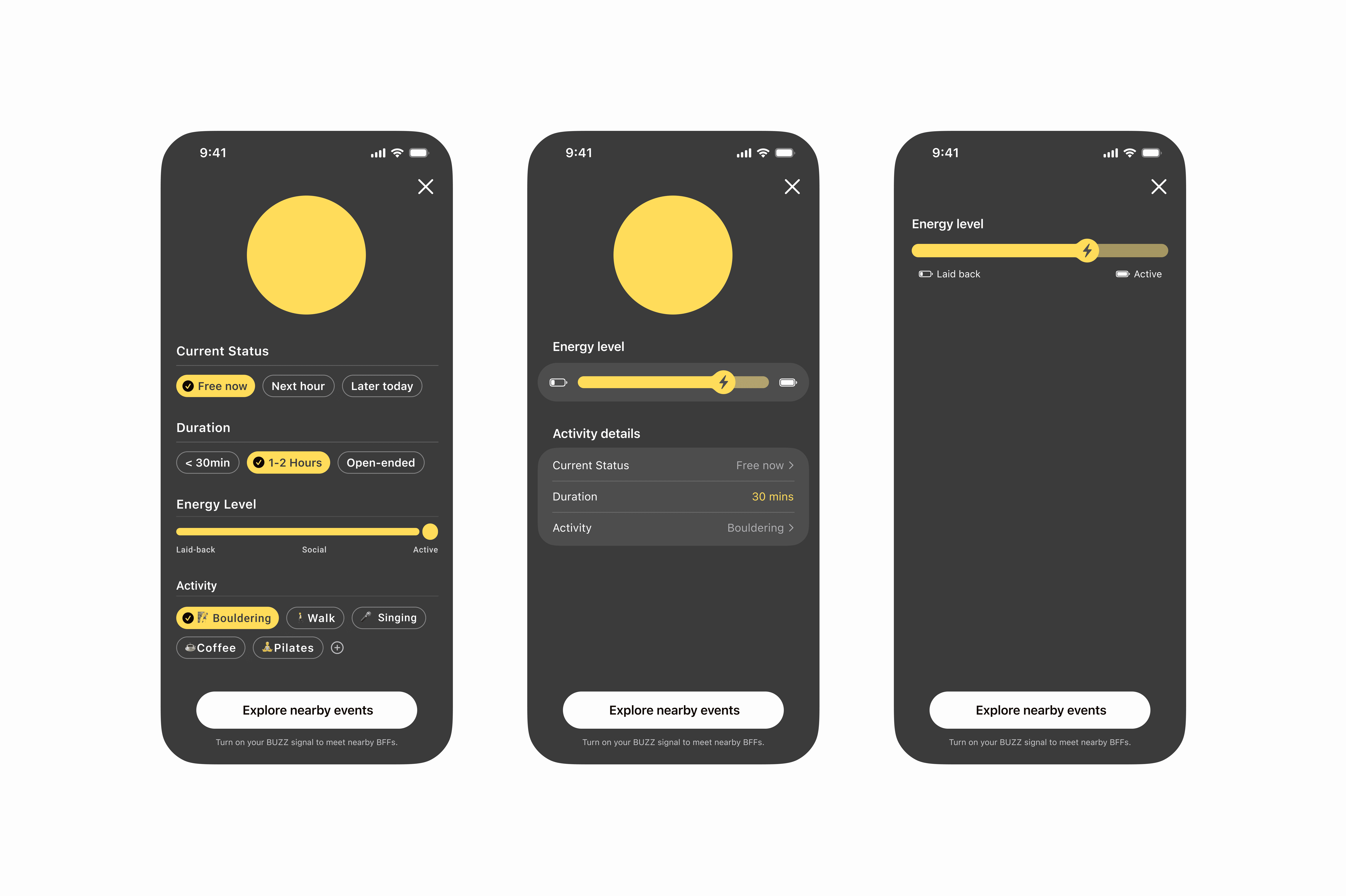
Users start by indicating availability for specific activities, then defining intent through details including availability, energy level, and Bumble-approved venues.
Map-based Discovery
BUZZ integrates with a map feature to suggest nearby events started by other Bumble users around the area.

From match to navigation, users select and show up in person all within one app, lowering barriers to action and increasing follow-through from intent to meetup.
Real-Time Notifications
When users agree on an activity, BUZZ activates a Dynamic Island live activity that shows each participant’s real-time progress toward the meetup location.
The same information is translated to a lock screen widget that shows live meetup status and participant progress at a glance.

Helping young adults turn online matches into casual, real-world connections.
Based on research insights, I designed BUZZ as a feature within Bumble to address declining adoption and retention rates.
Activity-Oriented Opt-In
Users start by indicating availability for specific activities, then defining intent through details including availability, energy level, and Bumble-approved venues.
Map-based Discovery
BUZZ integrates with a map feature to suggest nearby events started by other Bumble users around the area.
From match to navigation, users select and show up in person all within one app, lowering barriers to action and increasing follow-through from intent to meetup.
Real-Time Notifications
When users agree on an activity, BUZZ activates a Dynamic Island live activity that shows each participant’s real-time progress toward the meetup location.
The same information is translated to a lock screen widget that shows live meetup status and participant progress at a glance.
Research
Before designing, I analyzed users, competitors, and existing data.
Adoption, retention, and engagement data from existing Bumble features, including Proximity Alerts and Map Integration.
Here are some key takeaways:

Passive proximity alerts were not enough to sustain ongoing engagement.
BUZZ addresses this by making interactions activity-driven: shifted from "nearby" alerts to shared activities to drive repeat engagement.

BFF Users Convert Best
BUZZ optimizes the flow for casual, spontaneous fun rather than professional networking.
Research
Before designing, I analyzed users, competitors, and existing data.
Adoption, retention, and engagement data from existing Bumble features, including Proximity Alerts and Map Integration.
Here are some key takeaways:
Passive proximity alerts were not enough to sustain ongoing engagement.
BUZZ addresses this by making interactions activity-driven: shifted from "nearby" alerts to shared activities to drive repeat engagement.
BFF Users Convert Best
BUZZ optimizes the flow for casual, spontaneous fun rather than professional networking.
Design Explorations
To align every decision with Bumble’s mission, I developed product-specific design principles:
User-controlled proximity
Glanceable, low-pressure discovery
Lower friction to real-world action
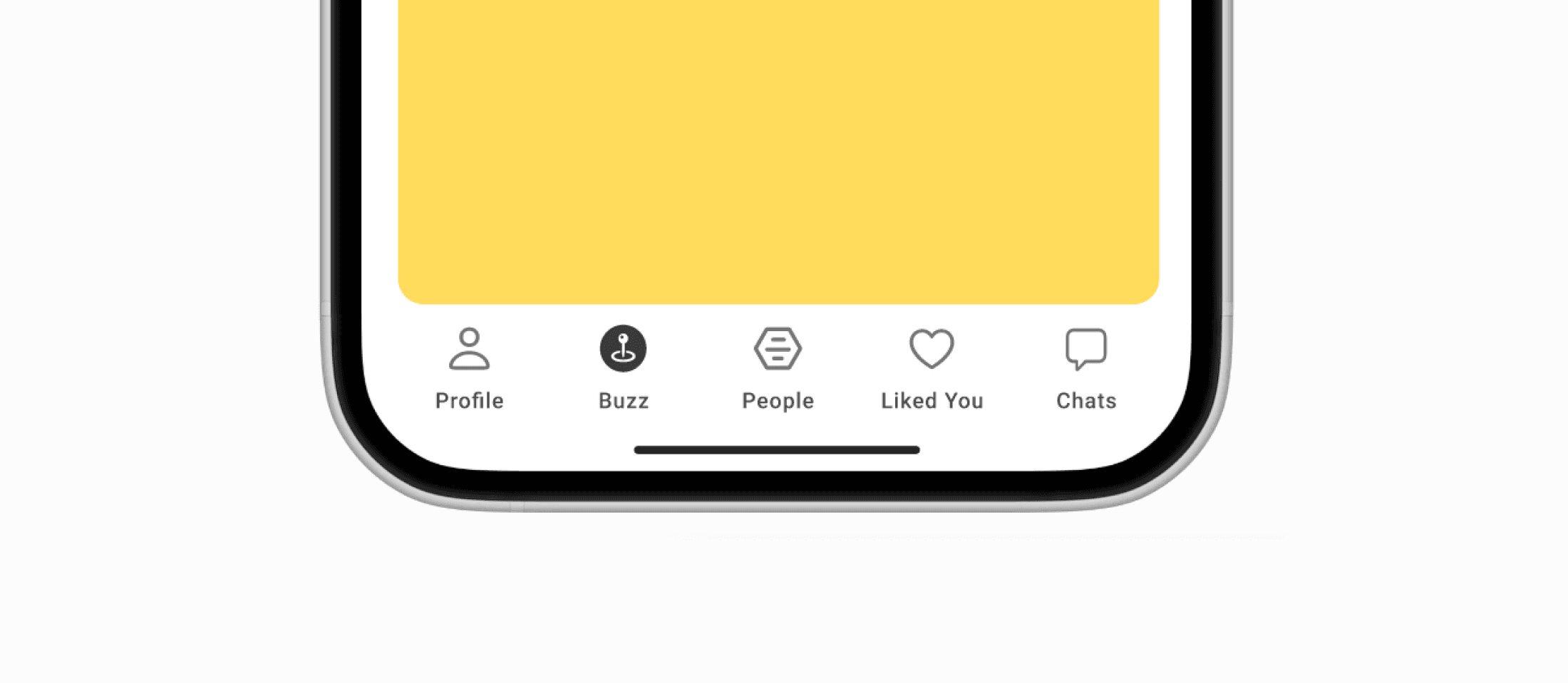
Bottom Nav Bar
To ensure an intuitive user flow that felt familiar and well-connected, I experimented with different entry points in the bottom navigation for BUZZ.
Considering the priorities of Bumble's features and the already crowded existing nav bar, the first two explorations risk breaking the retention loop of Bumble's main matching feature.
Since Discovery & BUZZ serve a similar core purpose, I settled on this version to maintain overall visual balance and minimize friction change.
Scaling Details
Moving away from rigid scrolling, I experimented with fluid scaling interaction for the activity circle and slider to translate the dynamic energy that BUZZ facilitates into motion.
Loading Screen Animation
I used the loading screen as an opportunity to incorporate soft pulses & gradients to create reassurance with supportive microcopy, helping users understand the purpose of the loading moment.
Auto-Generated BUZZ Moments
I extended this concept further by exploring how AI integration could reduce friction.
Here, by linking their calendar, BUZZ detects open time windows and suggests context-aware activities at the right moment. Instead of starting from scratch, users receive an auto-populated BUZZ ready to review and send.

Card Layout & Visual Hierarchy
On Create a Buzz, I aimed to display the minimum information required for an intuitive, low-friction experience while keeping a high-energy interface. Here are some of my fun experiments that did not make it to the end.
On Feed, my design moved from a standard list to be more dynamic and playful to highlight the spontaneous concept of BUZZ. Although visually chaotic, I had fun exploring :)

Design Explorations
To align every decision with Bumble’s mission, I developed product-specific design principles:
User-controlled proximity
Glanceable, low-pressure discovery
Lower friction to real-world action
Bottom Nav Bar
To ensure an intuitive user flow that felt familiar and well-connected, I experimented with different entry points in the bottom navigation for BUZZ.
Considering the priorities of Bumble's features and the already crowded existing nav bar, the first two explorations risk breaking the retention loop of Bumble's main matching feature.
Since Discovery & BUZZ serve a similar core purpose, I settled on this version to maintain overall visual balance and minimize friction change.
Scaling Details
Moving away from rigid scrolling, I experimented with fluid scaling interaction for the activity circle and slider to translate the dynamic energy that BUZZ facilitates into motion.
Loading Screen Animation
I used the loading screen as an opportunity to incorporate soft pulses & gradients to create reassurance with supportive microcopy, helping users understand the purpose of the loading moment.
Auto-Generated BUZZ Moments
I extended this concept further by exploring how AI integration could reduce friction.
Here, by linking their calendar, BUZZ detects open time windows and suggests context-aware activities at the right moment. Instead of starting from scratch, users receive an auto-populated BUZZ ready to review and send.
Card Layout & Visual Hierarchy
On Create a Buzz, I aimed to display the minimum information required for an intuitive, low-friction experience while keeping a high-energy interface. Here are some of my fun experiments that did not make it to the end.
On Feed, my design moved from a standard list to be more dynamic and playful to highlight the spontaneous concept of BUZZ. Although visually chaotic, I had fun exploring :)
Next Steps
Consider cross-platform experiences: Android interfaces and Apple Watch.

